Filter 100 product survey questions down to the five you will actually send.
Overall satisfaction and loyalty
How satisfied are you with [product] overall?
1 to 5. Baseline sentiment, and the number most teams already report, so it is the one that makes a trend comparable.
Wrong when: Asked right after a support ticket closes. The answer then measures the ticket, not the product, and it will quietly drag your product baseline toward your support quality.
How likely are you to recommend [product] to a friend or colleague?
0 to 10. Willingness to stake a reputation on you, which tracks referral behaviour better than satisfaction does.
Wrong when: Asked of a user who cannot recommend you, such as an admin on a tool their company mandated. They will answer anyway, and the score will be about procurement.
How would you feel if you could no longer use [product]?
Multiple choice. The PMF signal. How the answers split between people who would be badly stuck and people who would shrug tells you whether there is a core worth defending.
Wrong when: Asked in the first week of a trial. Nobody has built a habit yet, so most people pick the indifferent option and you conclude you have no fit when all you have measured is how new the accounts are.
Have you actually recommended [product] to anyone in the last six months?
Yes or no. Referral behaviour that has already happened, which is the check on a stated likelihood score. The two disagree more often than teams expect, and only one of them has a date attached.
Wrong when: Used instead of the 0 to 10 recommend question rather than beside it. On its own it says nothing about the people who would happily recommend you and have simply never been asked to, and that group is the entire point of a referral programme.
How likely is it that you will still be using this a year from now?
0 to 10. Renewal intent, the closest stated proxy for retention you can collect before the invoice arrives.
Wrong when: Asked of accounts on an annual contract with nine months still to run. They are not free to leave, so the answer reports the contract rather than the intent, and the optimistic reading will not survive the renewal call.
If you were choosing a tool for this again today, would you pick the same one?
Yes or no. Repurchase intent with sunk cost stripped out, which separates real preference from the inertia of an existing setup.
Wrong when: Asked of the person who championed the original purchase. Saying no means admitting in front of their own team that they chose badly, so the yes rate inflates. Route this one to the colleagues who inherited the tool instead.
Was there a point where you nearly stopped using this? What happened?
Open text. The specific incidents that put a retained account at risk, which is where a churn post mortem would have started had they actually left.
Wrong when: Asked of accounts that have already cancelled. The story has been justified internally and defended in a meeting, so it comes back tidier and more rational than the messy moment was. Ask while they are still deciding.
If you could change just one thing about [product], what would it be? And why?
Open text. Reproduced here as it circulates, inside one published list of 103 questions, because it is the most common double-barrelled question in product surveys and it is far easier to recognise than to describe.
Wrong when: Always, as written. It makes two asks and offers one box, so a short answer gives you the change or the reason and never both, and nothing in the reply tells you which half is missing. Ship it as two fields: the change, then an optional why.
Compared with what you expected when you signed up, how has this turned out?
Multiple choice. The gap between the promise in your marketing and the delivery in the product, which tells you whether a low score is really an acquisition problem.
Wrong when: Asked more than six months after signup. Memory of the original expectation has been overwritten by the current experience, so the answer collapses into a second satisfaction score and says nothing about the promise you made.
How do you feel about the direction [product] is heading?
1 to 5. Forward-looking confidence, which tends to move before satisfaction does and is usually the first thing to fall after a redesign or a packaging change.
Wrong when: Asked of people who have not opened the product since before your last release. They answer from the most recent email you sent them, so the score tracks your marketing cadence rather than anything you shipped.
What is the main reason for the score you just gave?
Open text. The cause behind a number, and the one field that makes a rating actionable: without it, half a point of movement is a fact with nothing attached to it.
Wrong when: Made a required field. Forcing a reason out of somebody who rated you a 9 collects "no reason, it is fine" at volume, which buries the few detailed answers, and it pushes the people with a real complaint into abandoning the survey rather than typing it.
Feature usage and value
Which of these have you used in the last 30 days?
Multiple choice. Self-reported breadth of adoption, most useful as a cross-check against product analytics: where the two disagree you usually have a naming problem.
Wrong when: Used in place of instrumentation. People under-report routine actions and over-report anything they feel they ought to be doing, so a list of fifteen items returns a flattering picture your event data will contradict.
How often do you use [feature name]?
Multiple choice. Usage frequency, which separates a feature that carries the daily workflow from one that earns its place only at quarter end.
Wrong when: Asked about something genuinely seasonal, such as an annual planning view. Everyone surveyed in March answers rarely, the feature looks dead, and it gets cut four months before the period when it does all of its work.
Put these in order, from the part you would fight hardest to keep to the part you would give up first.
Ranking. Relative value under a forced trade-off, which surfaces the ordering that a set of independent importance ratings always flattens.
Wrong when: Given a list longer than about seven items. Accuracy falls apart past the top few positions and the bottom half of the order is close to noise, so a deprecation decision read off it is a coin toss with extra steps.
If everything but one part were taken away, which part would you keep?
Multiple choice. Where the load-bearing value sits, and whether different roles point at different parts of the product.
Wrong when: Answered by one admin and read as the team's view. A multi-seat product carries several jobs at once, so the one person who fills in surveys quietly overrides the reason four colleagues log in every morning.
Before this survey, did you know [feature name] existed?
Yes or no. Discovery failure, held apart from value failure: a no here is a navigation or onboarding fix rather than a product one.
Wrong when: Placed after a question that has just described the feature. The description plants the memory, people answer yes out of politeness, and a genuine discovery gap gets filed as already solved.
Where did you look for [feature name] before you found it?
Open text. The mental model people bring to your navigation, which is the real specification for where the entry point belongs.
Wrong when: Asked of someone who has used the feature for months. They now recall the route they learned, not the one they hunted for, so the answer just describes your current menu back to you. It only works within a day or two of first use.
Is there anything here you tried once and never came back to? What put you off?
Open text. Value failure rather than discovery failure: they found it, used it, and judged it not worth a second attempt.
Wrong when: Asked of users who have never got past the first two screens. There is nothing to abandon, so they invent a plausible complaint to fill the box, and an untouched feature ends up with a defect report written about it.
What were you trying to do the last time you opened [feature name]?
Open text. The job the feature is actually used for, in the user's own words, which is frequently narrower than the one it was designed for.
Wrong when: Asked about something the person opened once, months ago. Recall of a single old session is reconstruction rather than memory, so gate it on a session in the last seven days or accept that you are collecting plausible fiction.
How much of this part of your work happens inside [product]?
Multiple choice. Share of workflow captured, the distance between partial adoption and being the system of record.
Wrong when: Asked during a pilot that was deliberately scoped to one team and one use case. A low share is the plan working, not a gap, and reading it as weak adoption sends an account manager in to fix something nobody broke.
How well does [feature name] fit the way your team already works?
1 to 5. Process friction, which explains why something with healthy usage numbers still generates complaints.
Wrong when: Asked of an individual contributor about a feature their manager configured. They can rate the steps they perform but not the constraint that shaped them, so a low score arrives with no lever attached and sits in the deck unused.
If [feature name] moved to a paid add-on, how likely would you be to buy it?
0 to 10. Willingness to pay at the feature level, safest read as a relative ordering across features rather than as a forecast.
Wrong when: Asked without naming a price. Every answer becomes a vote for liking the feature, the high scores evaporate the moment a number appears, and packaging gets decided on a demand curve that was never measured.
Does [feature name] go far enough for what you need it to do?
1 to 5. Whether a gap is a missing feature or an unfinished one, which is the difference between a new project and a small extension.
Wrong when: Asked about something shipped in the last fortnight. Early users are still finding the edges, so they rate depth against a guess at the design rather than against their own work, and the real ceiling only surfaces weeks later.
Usability and effort
How much effort did it take to [complete the task]?
1 to 5. Customer Effort Score for one concrete job, which predicts repeat use of a task people have to do more reliably than a satisfaction rating does.
Wrong when: Fired at people who abandoned the task. Effort only exists for a journey someone finished, so an exit trigger collects ratings from people who never found out how hard the remaining steps were, and the average comes back healthier than the flow actually is.
How clear was this screen about what you needed to do next?
1 to 5. Whether the interface communicates the next action, which separates a comprehension problem from a capability problem on a step with a high drop rate.
Wrong when: The version that circulates, "How easy was it to navigate our intuitive dashboard?", is broken twice over. The word intuitive hands the respondent the answer you want, and navigate covers every goal a person could have had, so a low score cannot be traced back to anything.
Where did you get stuck, if you got stuck at all?
Open text. Named friction points in the user's own words, which is how you find the failures that produce no error and therefore never reach your logs.
Wrong when: Run as a standing poll on every page. Open text costs the respondent real time, and asking it of people who sailed through returns "nothing" from most of them, which buries the handful of real reports and teaches everyone to dismiss your prompts on sight.
Did you finish what you came to do without asking anyone for help?
Yes or no. The self-serve completion rate, which sets the ceiling on how far support headcount can be decoupled from user growth.
Wrong when: Asked inside a workspace where one colleague is the designated admin. Those users route every question to that person by policy rather than because the product failed them, so their No is an org chart artifact and inflates your apparent support dependency.
When something went wrong, how easy was it to get back to what you were doing?
1 to 5. The recovery cost after a failure, which distinguishes a product that errors rarely from a product that errors gracefully.
Wrong when: Put in front of a whole cohort instead of only the people who hit an error. Those with a clean session either skip it, which damages your completion rate, or answer a hypothetical, which produces a number describing an event that never happened.
Which part was hardest to do on a phone screen?
Multiple choice. The specific small-screen failure, which is usually one dense table or one modal rather than the responsive layout as a whole.
Wrong when: Shown to desktop-only users, who will still pick something because a list of options invites a pick. Gate it on a session that actually ran at a small viewport, otherwise the winning option mostly reflects which item you placed first.
How would you rate the speed of the product while you were working today?
0 to 10. Perceived performance, which tracks the slowest interaction on a path rather than the median response time your dashboards report.
Wrong when: Used as a replacement for instrumentation you do not have. The answer establishes that people feel it is slow and never which call is slow, so a team without traces spends the next sprint optimising whatever it already suspected and cannot tell whether that helped.
Rank these steps by how much of your time they take.
Ranking. Where effort concentrates across a multi-step flow, which tells you which single step is worth rebuilding first.
Wrong when: Given to someone who has run the flow once. A ranking needs repeated exposure to be stable, and a first-timer orders the steps by how recent or how confusing each felt, so the same person returns a different order a week later.
Which of these labels would you look for to find [this feature]?
Multiple choice. Whether your naming matches the words people search with, a direct input to nav labels, help article titles and in-product search synonyms.
Wrong when: Asked of people who have used the product for a year. They have learned your vocabulary and will confirm your current label, while the newcomers who cannot find the feature at all are the only population whose answer would change the label.
Did the help article you opened answer your question?
Yes or no. Documentation deflection at the article level, which tells you which pages to rewrite rather than how many people opened them.
Wrong when: Placed at the bottom of a long article. Only readers who scrolled that far can vote, and the people whose question was not covered left by the second paragraph, so your least useful pages quietly collect the cleanest scores.
What made you contact a person instead of finding the answer yourself?
Open text. The reason support volume exists, sorting tickets into missing documentation, distrusted documentation, and problems only an account holder can resolve.
Wrong when: Sent after the ticket is closed and the agent was friendly. Gratitude rewrites the story, so people report that they simply prefer talking to a human rather than that your search returned nothing usable. Ask it at the moment the ticket is opened.
Onboarding and first run
How long was it between signing up and getting something useful out of the product?
Multiple choice. Self-reported time to first value, which anchors the activation window your instrumentation should be held against.
Wrong when: Asked of an account someone else configured and handed over. That person's clock starts at a working workspace, so they answer in minutes and hide the two weeks the admin spent, and onboarding looks far cheaper than it is to the people who buy it.
Have you finished setting up, or is something still unfinished?
Yes or no. Self-reported completion, which often disagrees with the completion flag in your database and exposes steps users treat as optional that you treat as required.
Wrong when: Asked of a trial with three days left on it. People answer yes because they want the trial to have counted, not because the integration is connected. Read it next to a server-side check, or wait until the buying decision has passed.
Before you signed up, what did you think this product would do for you?
Open text. The promise the user arrived carrying, which is where a mismatch between acquisition copy and the first run begins.
Wrong when: Asked six months in. By then the person describes what the product does today, because using it has overwritten what they once assumed. This question has a short shelf life and only returns honest material within the first days after signup.
How closely does the product match what you expected before you signed up?
1 to 5. The size of the gap between the promise and the delivery, a leading indicator of early churn that no usage metric surfaces.
Wrong when: Asked without an open follow-up. The midpoint tells you a gap exists and nothing about its direction, and a product that overshot in one area while missing in another lands on exactly the same number as one that was merely adequate everywhere.
Which setup step took you the longest?
Multiple choice. Where onboarding time concentrates, which decides whether a step gets automated, documented, or dropped from the required path.
Wrong when: Offered with a list of steps that hides the waiting between them. If the real cost was a colleague sitting on an API key, no option describes it, the respondent picks the nearest step, and organisational delay lands on your engineering backlog as a UI problem.
Who did the setup work on this account?
Multiple choice. Whether activation depends on a human assist, which determines if onboarding can scale with self-serve signups or only with headcount.
Wrong when: Sent to single-seat accounts, where only one answer is possible. The result says most people set up alone, which is true by construction and says nothing about the multi-seat accounts where a stalled admin is the actual bottleneck.
Was there a moment during setup when you nearly gave up?
Open text. The strongest failure point in the flow, which is systematically under-reported because the people it defeated are not in your active user list.
Wrong when: Asked only of activated users, which is the sample that survived. The answers describe irritations people pushed through and never the wall that stopped anyone, so your worst step never appears. Send the same question by email to signups that stalled.
What was the first thing you did that made the product feel worth keeping?
Open text. The activation event in the user's own words, which shows whether the moment you optimise for is the moment that actually converts.
Wrong when: Asked before the person has reached any such moment. A user three screens into setup will invent an answer to be helpful, and an invented activation event is worse than none, because teams then rebuild onboarding to push everyone toward a moment nobody had.
How confident are you that you can run this on your own from here?
0 to 10. Perceived self-sufficiency at the end of onboarding, which predicts support contacts over the next weeks better than a completed setup checklist does.
Wrong when: Asked of the person who bought the product but will never operate it. Their confidence is an opinion about someone else's job and stays high whatever the state of the setup, which hides the risk sitting with the person who has to use it daily.
How clear was it what to do first after your first login?
1 to 5. Whether the empty state directs the user, which is where most first-session drop-off happens before any feature has been opened.
Wrong when: Reported as one average across signup sources. Someone arriving from a template link lands on a different first screen than someone who signed up cold, so a single number describes nobody, and it drifts every time your traffic mix changes rather than when the screen does.
Pricing and value for money
At what price would [product] be so expensive that you would not consider it?
Open text. The upper bound of the Van Westendorp price sensitivity meter, and the point where price stops being a negotiation and becomes a disqualification.
Wrong when: Asked of a user who does not hold the budget. An end user names a number from their own pocket and a procurement lead names one from a department plan, and pooling the two produces a curve that describes nobody.
At what price would [product] be so cheap that you would question whether it is any good?
Open text. The lower bound of the Van Westendorp meter: the point where a low price reads as a signal of weakness rather than a saving.
Wrong when: Asked in a category where free tiers are the norm. Respondents anchored on competitors that cost nothing answer that no price is too low, the lower curve flattens against zero, and the acceptable range reads far wider than the market will actually bear.
At what price would [product] start to feel expensive, though you would still think about buying it?
Open text. The point of price resistance on the Van Westendorp meter, where the purchase moves from routine to deliberated and needs a second person to approve it.
Wrong when: Asked of existing paying customers, who already know what they pay. The invoice is the anchor, most answers land just above it, and you end up measuring your current price list rather than the market's tolerance for a different one.
At what price would [product] be such good value that you would buy it without much deliberation?
Open text. The point of marginal cheapness on the Van Westendorp meter, and the price at which the decision stops needing a business case.
Wrong when: The respondent has only read a description and never used the thing. Pricing a paragraph, they reach for what similar sounding tools cost, so the number reports category familiarity rather than the value of your product.
Thinking only about what you get for what you pay, how would you rate the value?
1 to 5. Perceived value for money as a single tracked number, comparable across releases and across segments, and an early indicator of churn at renewal.
Wrong when: The version that circulates elsewhere is double-barrelled: 'How satisfied are you with our pricing and the features you receive?' A 2 there can mean the price is too high or the features are too thin, and the two need opposite fixes. Nothing in the answer says which.
Which plan comes closest to what you actually need, rather than what you are on today?
Multiple choice. The gap between packaging and real demand, and which tier boundaries are pushing people into a plan that fits badly in either direction.
Wrong when: Asked during a trial. Every plan looks adequate before anything has been used at volume, so nobody has met a limit yet and the answers cluster on the cheapest tier. Plan fit only becomes answerable after a first full billing cycle of real usage.
What would have to be included in the next plan up for you to move to it?
Open text. The specific contents of an upgrade decision, and whether your current tier boundary is drawn around something people will actually pay to cross.
Wrong when: Asked of free-plan users who have never paid for anything in this category, the answers are a wish list with no cost attached. Treat them as candidates to test behind a paywall, never as a forecast of upgrades, because naming a feature and buying it are different acts.
Would you rather be charged per user, by how much you use, or one flat amount?
Multiple choice. Preference between billing models, and how much predictability is worth relative to paying only for what is consumed.
Wrong when: Run on a sample skewed to one account shape. People pick whichever model shrinks their own bill, so a survey of small teams elects per user and a survey of large ones elects flat. Without light and heavy accounts in proportion, the winner is decided by who you invited.
At [price] per month, would you buy it?
Yes or no. One point on a Gabor-Granger demand curve. Repeated across several prices in random order, the set of answers gives the share of buyers at each level.
Wrong when: Asked once, at the price you hope to charge. Respondents read a single figure as a yes or no on the product rather than on the price, and agreeableness inflates it. Without several prices shown in random order there is no curve, only a compliment.
If your budget were cut, rank these parts of what you pay for in the order you would give them up.
Ranking. The internal order of value inside one bill, and which line items get defended when money is scarce. A ranking forces the trade-off that a rating scale lets people avoid.
Wrong when: Put to accounts that never adopted half the list. People discard what they never switched on, so the bottom of the ranking is an adoption report rather than a value judgement, and you cut a capability that was only ever badly onboarded.
What to build next
What is the one thing [product] does not do that you wish it did?
Open text. The top unmet need per respondent, and because it is capped at one it produces a countable ranking rather than a wish list.
Wrong when: Asked as "What is the one thing you would change, and why?" That version makes two asks, so a short answer gives you the why and not the what, or the what and not the why, and you cannot tell which half is missing.
In the last month, what did you try to do in [product] and could not?
Open text. An attempted action with a date attached, which is evidence of demand rather than a prediction of it.
Wrong when: Asked of someone who signed up a week ago and has not yet formed the habits that produce blocked attempts. They answer with a first-run confusion, you file it as a missing capability, and the onboarding bug it actually was never gets fixed.
How are you handling this today, outside [product]?
Open text. The substitute already in use, including the spreadsheet or second tool you are quietly competing with, and how costly that habit would be to give up.
Wrong when: The workaround has been in place long enough to feel normal. People who have exported to a spreadsheet every Monday for two years describe it as part of their process, not as a gap, so a real hole in the product reads back as satisfaction.
If we could ship only one of the two options below in the next quarter, which would you choose?
Multiple choice. Relative demand between two candidates that both look strong when rated in isolation, since a forced choice removes the option of wanting everything.
Wrong when: The two options do not compete for the same people or the same quarter. A respondent who would happily take both is made to invent a preference, and the winning percentage then settles a roadmap argument that the answers never actually spoke to.
Rank these five candidates from most useful to least useful for your work.
Ranking. An ordering inside the shortlist, and the gap between second and third place, which is usually where the real planning decision sits.
Wrong when: Used as the only demand question you ask. A closed list can return nothing but an item someone on your team already thought of, so a genuine top need that is missing from the five comes back as a confident ranking of the wrong things. Always pair it with one open question.
Of these four, pick the one that would help you most, then pick the one that would help you least.
Multiple choice. Both ends of the preference spread at once. It records two separate picks rather than one answer, which is why it is not the double-barrelled question it first appears to be, and it separates options people actively do not want from ones they are merely indifferent to.
Wrong when: Repeated past five or six sets of four in one sitting. Attention drops, people begin picking the first and last item in each set out of habit, and the later sets contribute noise that arrives looking like signal.
How often does this problem come up in a normal working week?
Multiple choice. Whether the gap is a daily tax or a yearly annoyance, which sets the size of fix that is worth funding.
Wrong when: The respondents are the thirty people who replied to a post on your feedback board. A self-selected group reports high frequency by definition, because that is why they turned up, and a tally of the loudest few gets read back as market demand.
Would you move to a higher plan to get this?
Yes or no. Whether the need is priced or only preferred, and it is the cheapest available filter on an otherwise unanimous wish list.
Wrong when: Read as revenue. Stated willingness to pay runs well above what the same people do at a checkout, especially when no number is on screen, so treat every yes as a shortlist for a real upgrade offer rather than as a forecast.
Which roles on your team would use this besides you?
Multiple choice. Whether the request belongs to one person or to a seat count, which changes both the expansion case and who has to sit in the design review.
Wrong when: The respondent is an individual contributor answering on behalf of a department they do not sit in. They report what they imagine colleagues need, and you size a feature for roles nobody ever asked directly.
If this existed tomorrow, how would you feel about it?
Multiple choice. Whether a capability is genuinely wanted or simply assumed to be there already, since an answer of "I would expect that" marks a gap you are being judged on today.
Wrong when: Sent from a company address a few weeks before a launch. Respondents read a hypothetical from a vendor as a commitment, support starts getting asked for the date, and a question meant to size interest has quietly become an announcement.
If we never build this, how much would that affect your work?
1 to 5. The cost of inaction, which is what separates a pleasant addition from a condition of staying.
Wrong when: Asked on its own. Without the matching question about the capability existing, a high score cannot be told apart from general frustration with the product, and the two answers only carry meaning as a pair from the same respondent.
To get this, what would you accept being slower, simpler or unavailable?
Open text. Whether the respondent holds any real trade-off at all, and which existing behaviour they value least, which is hard to learn any other way.
Wrong when: Asked of a respondent on a free plan with nothing at stake, who offers up a feature they have never opened. Weight the answers by whether the thing given away is something that account actually used in the last ninety days.
New product and concept validation
In your own words, what does the product you just read about do?
Open text. Whether the concept survives one retelling, and which part of the positioning people drop or invent when the copy is no longer in front of them.
Wrong when: The description is still visible on the same screen. Respondents copy phrases back and comprehension looks total. Ask it on the next screen, before any rating question, or you are grading short-term reading memory instead of whether the idea lands.
How appealing is this idea to you?
0 to 10. Concept appeal as a comparable number, useful for ranking several concepts against each other in the same study rather than for judging one alone.
Wrong when: Fielded only to your own newsletter or user list. A warm audience rates almost every concept highly, so an isolated score has no meaning. Run at least two concepts past the same people, or hold a benchmark from a previous concept on the same list.
If this were available today, how likely would you be to buy it?
1 to 5. Purchase intent on the standard five-point scale, read as a top-box share and discounted, not as a direct forecast of conversion.
Wrong when: No price and no switching cost are shown. Stated intent collected against a free hypothetical measures enthusiasm, and the top box routinely runs several times above what people do. Attach a price to the concept before you read the number as intent.
If you started using this, what would you stop using or stop doing?
Open text. The thing being displaced, which tells you who you are really competing with, including spreadsheets and manual routines that never appear on a competitor list.
Wrong when: Asked about a concept that adds a new activity rather than replacing an existing one. The question presumes a substitution, so respondents name something to be helpful, and you read a displacement that will not happen. Ask what it would sit alongside instead.
What would have to be true for you to move from what you use today to this?
Open text. The conditions attached to a switch, and whether the barrier is the product, the migration, or a commitment that has nothing to do with either.
Wrong when: Run on a sample that has never actually switched anything. People who only considered it name price. People who have moved name the data migration and the month it took. Pool the two and the expensive condition disappears under the cheap one.
Compared with how you handle this today, how much better or worse would this be?
Multiple choice. Relative value against the incumbent, which is the only comparison that decides adoption. Absolute appeal ignores the cost of leaving what already works.
Wrong when: The comparison is unfair by construction at concept stage: a described product has no bugs, no setup and no edge cases, while the current tool is judged as lived. The concept wins on imagination, and you inherit the expectation gap at launch.
In the last three months, have you tried to solve this yourself with a spreadsheet, a script, or a manual routine?
Yes or no. Evidence of an unmet need through behaviour rather than opinion. Effort already spent is a far stronger signal than agreement with a problem statement.
Wrong when: Asked with an open recall window. Phrased as 'have you ever', nearly everyone says yes at some point in a career, the answer separates nobody, and the question stops discriminating. The bounded period is what makes a yes worth anything.
Would you be willing to use an early version that is incomplete and may break?
Yes or no. Willingness to join an early access cohort, and the size of the group prepared to trade reliability for being first.
Wrong when: The invitation goes only to your most engaged users. They say yes out of loyalty, tolerate the rough edges, and report none of the confusion a first-time user hits. The beta then validates a build that new accounts cannot get through.
Rank these parts of the concept by how much each one would matter in your work.
Ranking. A forced trade-off between the pieces of the concept, which separates the part worth building first from the parts that merely sound agreeable.
Wrong when: The list mixes grains: a whole workflow listed next to a single button. Respondents rank by how important the words sound rather than by the work involved, and a broad item wins simply because it covers more. Keep the items at one level.
What is the single biggest reason you would not adopt this?
Multiple choice. The dominant objection, and whether it sits in the product, the buying process, or the team around the respondent.
Wrong when: Used as the first study on a new concept: a closed list can only return the objections you already thought of, and the real one hides inside the other option. Run it open first, code the answers, then offer those codes as options in the next wave.
Competitors and switching
What were you using to handle this work before you started with us?
Multiple choice. Whether you win against a named tool, against a spreadsheet, or against nobody doing the job at all, which decides who your positioning actually has to argue with.
Wrong when: Asked a year into the account. People misremember their old stack and compress three tools into one answer. Capture it during onboarding, while the previous setup is still open in another tab, and store it on the record instead of resurveying for it later.
What made you start looking for something different?
Open text. The event that opened the buying window, which is the signal your acquisition timing and your outbound campaigns can be built around.
Wrong when: Pointless for accounts that arrived through a free trial someone opened out of curiosity, with no problem in front of them. They will invent a trigger to be helpful, and invented triggers are indistinguishable from real ones once they are in the spreadsheet.
Which other tools did you seriously compare us against?
Open text. Your competitive set as buyers draw it, which is usually narrower and stranger than the set your team argues about internally.
Wrong when: Meaningless when the buyer inherited the decision from a parent company, an agency or a predecessor. They can only name what was handed to them, so their empty answer is filed as "no competition" and your competitive set reads thinner than it is.
What almost made you stay with [the tool you used before]?
Open text. The retention hook a rival holds over its customers, whether that is stored history, a contract date, or one workflow nobody wanted to rebuild.
Wrong when: Asked once the migration is finished and the pain has faded. The switching cost that nearly stopped them is only vivid while it is happening, so ask in the first week, with the half-moved data still in front of them, not at the quarterly check-in.
If we shut down tomorrow, put these options in the order you would try them.
Ranking. Which substitute the account treats as nearest, and whether going back to manual work sits above or below a rival in that order.
Wrong when: A hypothetical with no cost attached, so it reports preference and gets read as behaviour. Wrong as the basis for a churn-destination model: the integrations churned accounts request, and the tools support sees in their exports, answer that with evidence.
What do we do better than [the other tool you considered]?
Open text. The differentiator in the customer's own vocabulary, which is usually the phrasing your landing page should be borrowing rather than inventing.
Wrong when: The version that circulates elsewhere, "What are our strengths and weaknesses compared to [competitor]?", makes two asks in one box. Respondents answer whichever half they feel more strongly about, and a short reply that skipped the weakness is unreadable against one that found none.
What does [the other tool you considered] do better than us?
Open text. The concession a customer who already chose you is willing to make out loud, which is the most credible gap list available to you.
Wrong when: Sent from a named account manager's address to a customer weeks before renewal. Telling the person who owns the relationship that a rival is better feels like opening a negotiation, so the replies come back polite and empty. Send it unsigned or through a research address.
Are you still running another tool alongside us for the same work?
Yes or no. Whether you displaced the incumbent or merely joined the stack, which separates a safe account from a coexistence that ends at the next budget review.
Wrong when: Your own integrations list already answers it. An account with an active sync to the other tool is visibly running both, and confirming it by survey spends the one question you had on something a database query returns for every account.
Churn and win-back
What is the main reason you are cancelling?
Multiple choice. The stated driver in a countable form, which turns churn into categories you can size rather than a folder of anecdotes.
Wrong when: "Too expensive" sits first in the list. It is the easiest answer to give and it excuses the respondent from explaining anything else, so a list that leads with it reports a pricing problem whatever the real cause was. Rotate the option order.
Are you still doing this work somewhere else, or has the need gone away?
Multiple choice. Whether this is a competitive loss or a dissolved use case, two outcomes that call for completely different responses from the product team.
Wrong when: Asked of accounts closed because the company was acquired or shut down. The answer gets forced into a product category when the cause was corporate, and one acquisition losing forty seats can make a healthy segment look like it stopped needing you.
What could we have done that would have changed your decision?
Open text. The specific save that was still on the table, and, where answers repeat, the intervention your retention play should be built around.
Wrong when: Asked after the account is closed and the refund processed, when nothing can be influenced and the respondent knows it. Put it inside the cancellation flow, before the final confirm, where a named save can still reach someone the same day.
Was there a particular moment when you decided to stop? Describe what happened.
Open text. The concrete incident sitting behind an abstract reason, usually an outage, a failed import or an unanswered ticket you can match against the support log.
Wrong when: It only goes to people who click through the cancellation flow. Slow-fade churn, the accounts that quietly stopped logging in months before the card expired, has no moment to describe, and it is usually the larger half of the loss.
Would you consider using us again in the future?
Yes or no. The size of the win-back list, separating accounts worth a future campaign from ones where further contact is wasted on both sides.
Wrong when: A yes costs the respondent nothing, so it is permission to stay in touch, not a forecast. Wrong as the sole trigger for a win-back sequence: paired with nothing, it mails people whose actual blocker you never learned, on a date you picked at random.
What would have to be true for you to come back?
Open text. The named condition, a missing capability, a price point, an expiring contract, that a re-engagement message can be triggered on the day it becomes real.
Wrong when: Asked of someone who cancelled in anger over an incident that is still open. What comes back is the complaint again, not a condition, and the win-back list fills with apologies you have already made. Wait a fortnight and ask then.
If a smaller version at a lower price had been available, what would you have done?
Multiple choice. Whether the account was rejecting the price or the product, which is the difference between a plan gap you can close and a fit problem you cannot.
Wrong when: You have no intention of building a cheaper tier, so you create an expectation you will not meet. The answers also run optimistic: far more people say they would have downgraded than accept a downgrade when one is offered at the moment of cancelling.
Your account has been quiet for [a while]. What is getting in the way of using it?
Multiple choice. The stall reason while the subscription is still alive, which is the only churn signal that arrives early enough to do anything about.
Wrong when: Sent to seats that were never meant to be active: the admin who bought for a team, the shared billing address, the auditor. They report no blocker because they have no use for the product, and their replies dilute the stall reasons that matter.
Did you ever get the thing you originally signed up for working?
Yes or no. Whether this is failed activation or value lost after a working start, two churn shapes with different owners: onboarding in one case, the product itself in the other.
Wrong when: Your product analytics already record the activation event. Self-reports disagree with the logs, people who half-finished a setup answer yes, and you have spent a question on a worse copy of something you can query for every account at once.
Is there anything else you want to tell us before you go?
Open text. The reason that fitted none of the options you offered, plus the tone, which predicts whether this account will speak badly of you in public.
Wrong when: Placed as the last field of an eight-question cancellation flow. By then the respondent wants to be gone and the box collects "no" or nothing at all. It earns its keep as the second question, where the person still has something to say.
Screening and profiling
Which of these best describes your role?
Multiple choice. The segment a respondent belongs to, which is the variable every other answer in the survey gets cut by.
Wrong when: Shipped as a free-text box. Titles arrive as "Head of Product", "product lead", "PM II" and "founder, also does product", nobody tabulates four hundred of those by hand, and the segmentation the whole survey was built around never happens.
How long have you been using [product]?
Multiple choice. Whether an opinion comes from the first week or the third year, which is the difference between an onboarding complaint and a mature-use gap.
Wrong when: Your own database already holds the signup date. You spend a scarce question slot on a fact you could join in afterwards, and a long-standing customer who knows you have it reads the question as proof that nobody looked them up.
How often do you open [product] in a normal week?
Multiple choice. The respondent's own sense of their usage, which is the frame everything else they wrote was written inside.
Wrong when: Treated as a usage metric. Self-reports drift upward and bunch on round answers, while your event data already holds the truth. Keep the question only to see where belief and logs disagree, because that gap is the finding.
Were you involved in the decision to start using [product]?
Yes or no. Whether the answers come from someone who can renew or cancel, which sets how much weight a pricing objection deserves.
Wrong when: Asked in a self-serve product where everyone signed themselves up: almost every answer is yes and the question segments nothing. It earns its slot in larger accounts, where the person using the tool daily is rarely the person who approved the invoice.
How many people are on your team?
Multiple choice. The scale a request has to work at, and whether a complaint about permissions is one odd account or an entire tier's problem.
Wrong when: Asked in a survey you promised was anonymous, sitting next to role and country. Across four hundred accounts, "engineering lead, 2 to 10 people, Norway" is one identifiable person, and a respondent who works that out stops telling you anything uncomfortable.
Which of these describes you best right now?
Multiple choice. Which of three very different stories you are collecting, since a churn reason and a feature request should never land in the same tally.
Wrong when: The send list was built from active accounts. The former-user bucket comes back near empty and you conclude nobody leaves for that reason. To hear from that group they have to be invited from billing records, not from recent logins.
How many questions a product survey should actually contain
This page holds 100 product survey questions, and no single survey should use more than about eight of them. Every question you add costs response rate, and the ones people abandon are the open questions at the end, which are the ones worth reading.
Pick one outcome question, at most three diagnostic questions that could explain a bad answer to it, and one open question. That is five. The other 95 on this page exist so you can find your five, not so you can send fifty.
The cut gets easier if you write the decision down first. A question earns its slot when you can name the thing you would do differently depending on the answer. A question that is interesting but changes nothing is why surveys get a reputation for wasting customers' time, and it is also why question eight gets a careless answer rather than no answer at all. A careless answer still lands in your average.
Length is not the only budget, and channel matters more than length does. An in-app survey that fires on a screen somebody is trying to leave should ask one question, occasionally two. Five to eight is an emailed survey, sent to a list that already expects to hear from you, and even there the completion curve bends sharply once an open field appears.
Which category to use, and when to send it
The ten categories below are not topics, they are send conditions. Each one answers a different question, reaches a different population and goes out at a different moment, which is why a survey assembled from three categories at once usually returns three unusable thirds.
Two of the ten are the reason this bank exists. Nine pages ranking for product survey questions were read on 20 September 2026. Not one of them has a block for what to build next, and not one publishes a single screening question. A bank with no screeners produces answers you cannot segment, which is the most common reason a completed survey gets read once and never referenced again.
The satisfaction block carries the 0 to 10 recommend question and the 1 to 5 satisfaction question with their wording and their scale, and nothing else. No formula, no bands, no benchmark table: turning those answers into a score is a separate job, and it has its own page on this site.
| Category | What the answers tell you | When to send it |
|---|---|---|
| Overall satisfaction and loyalty | Whether the relationship is holding, in one number you can trend across quarters | Quarterly to the whole base, or at renewal. Never inside a support reply, which measures the ticket instead |
| Feature usage and value | Which parts of the product carry the value, and which are shelf-ware nobody found | After about 30 days of use, to accounts your analytics show have actually opened the feature |
| Usability and effort | How hard the product is to operate, task by task rather than as an impression | Immediately after the task, on the screen where it happened, not in a monthly round-up |
| Onboarding and first run | Where new accounts stall before they get anything useful out of you | Day 7 to day 14, once setup has either finished or clearly stopped. Not on day one |
| Pricing and value for money | What people will pay, and the point at which price stops being a negotiation | Before a pricing change, to the people who hold the budget, and never during a billing incident |
| What to build next | Which of the things you could build is worth building first, as a count rather than a wish list | During discovery, to people who have hit the problem in the last 30 days |
| New product and concept validation | Whether something that does not exist yet is understood, wanted and worth paying for | Before the build, to the market you intend to sell it to rather than to your happiest current users |
| Competitors and switching | What you were bought instead of, and what you would lose them to | In the first 60 days, while the comparison they ran is still fresh enough to recall |
| Churn and win-back | Why an account left, and what would have to change for it to come back | In the cancellation flow for the reason, then again 60 to 90 days later for the truth |
| Screening and profiling | Who is answering, so that every other answer can be cut by role, tenure and usage | First, or not at all. Pull it from your own records instead if you already hold it |
The scale decides what the answer is worth
Pick the scale before you write the wording. A question written first and scaled afterwards ends up with whatever the survey tool defaulted to, and a badly scaled question does not fail loudly. It returns a full set of answers that cannot be used, which is the most common way a good question produces unusable data. That is why every entry in this bank states its scale rather than leaving it to you.
Six formats cover almost everything a product team needs to ask. A 0 to 10 scale gives eleven points and earns them only if you intend to read the distribution rather than the average. A 1 to 5 scale is the default for a rating you want to trend, and every point should be labelled in words, so that a 3 means the same thing to somebody reading it in their second language. Yes or no is a filter rather than a measurement: its job is to decide who sees the next question. Multiple choice can only ever return an option you already thought of, so it belongs after you have run the open version at least once. Ranking stops being reliable past about five items, because people order the top two and then guess. Open text carries the most information and the most drop-off, which is why it goes last.
A 0 to 10 answer and a 1 to 5 answer are not convertible. Rescaling a 4 out of 5 into an 8 out of 10 assumes both scales were read the same way, and they are not: eleven points spread the middle and five points collapse it. Change the scale and your series starts again from that date, so decide once and then leave it alone for as long as you want the trend.
Score 1 to 5 answers both waysLeading questions in surveys, and the ones that ask two things at once
A leading question carries its own answer. "How easy was our new setup flow?" has already decided that setup was easy and leaves the respondent choosing a degree. The fix is to delete the adjective and let the scale carry the judgement: "How much effort did setup take?" Read everything you are about to send and strike out easy, simple, powerful, helpful, seamless and improved. Each one is a thumb on the scale, and each one shifts the result in a direction you chose rather than one you measured.
An unbalanced answer list does the same thing more quietly. Options running excellent, good, fair, poor offer three positive rungs against one negative one, so the midpoint of the list sits above neutral and the average drifts upward whatever people actually think. Balance the options around a real middle, or remove the middle deliberately and say why.
A double-barrelled question makes two asks and accepts one answer. "How satisfied are you with our pricing and support?" cannot be answered by anybody who values one and resents the other, and the number it returns cannot be traced back to either. The test takes a second: if a respondent could reasonably answer differently to each half, it is two questions, so split it. The same applies to any question with "and why" bolted onto the end, which is the most common version in circulation.
This is where the pages ranking for this query fall down, and it was measured rather than assumed. Of nine pages read on 20 September 2026, four warn against leading and double-barrelled questions in a separate advice section, none applies that rule to a single one of its own questions, and one ships at least three double-barrelled questions inside its own list of 103. That is why the wording problem is annotated on the question itself here, in the same line as the scale, instead of being taught once at the top and forgotten by the time the list starts.
Getting the answers back in a shape you can act on
A hundred questions is the easy half. How many people answer is decided by where the survey fires and who it fires at, and whether the answers are worth having is decided by what they land next to.
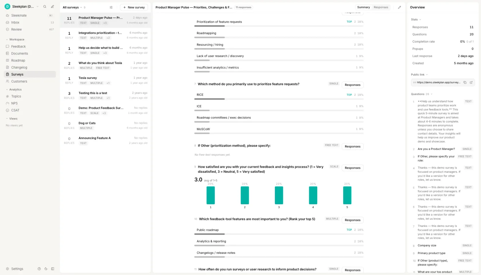
Sleekplan runs the survey where the behaviour happens. A survey triggers on a URL, a segment, a plan or an action, so the effort question reaches the person who has just finished the task and the pricing question reaches only the people who hold the budget. Branching means a detractor and a promoter see different follow-ups from the same send, which is how a survey stays at three questions per respondent while still covering eight. Responses can be collected anonymously when the honest answer is one nobody wants to sign.
Results come back per question rather than as a single completion figure: the answer breakdown for each question, the drop-off point for each step, and the individual responses behind the number. Because the survey sits in the same workspace as the feedback board, a 2 out of 5 is one click from everything that account has already asked for, and a free-text answer can become a feedback post without anybody retyping it.
That last part is what a question bank on its own cannot give you. The wording is on this page and it is free to take. What decides whether the answers are worth reading is who saw the question, and what happened to the reply afterwards.
How to write survey questions
Write down the decision before you write the question
Name the thing you would do differently depending on the answer, in one sentence, before any wording exists. "If effort scores on import are worse than on export, we rebuild import first" is a decision. "We want to understand the customer journey" is not, and a survey built on it will produce a deck rather than a change. Questions that survive this test write themselves; the ones that do not are the ones you were going to cut at question nine anyway.
Pick the instrument, not just the topic
Every question is measuring something that already has a name and a known failure mode: satisfaction with a moment, likelihood to recommend, effort on a task, willingness to pay, frequency of a behaviour, or raw open feedback. Choosing the instrument first tells you the population and the moment as well as the format. Effort belongs immediately after the task and to people who finished it. Willingness to pay belongs to whoever holds the budget, which is often not the person using the product.
Set the scale, then write the wording to fit it
Decide on 0 to 10, 1 to 5, yes or no, a choice list, a ranking or an open field before the sentence exists, because the scale decides what the sentence is allowed to ask. A question phrased for a rating and shipped as a choice list loses its middle. Label every point in words as well as numbers, keep the list balanced around a real neutral, and cap a ranking at five items, because people order the top two honestly and guess the rest.
Make exactly one ask per question
Read each question and ask whether a respondent could reasonably answer differently to two parts of it. "How satisfied are you with the price and the support?" fails, and so does any question with "and why" attached, because a short answer then gives you one half and hides which half is missing. Split it into two questions, or keep the ask and move the why into its own optional open field underneath.
Take the adjective out and balance the options
Delete easy, simple, intuitive, powerful, seamless and helpful wherever they appear in a question, because each one tells the respondent which answer you are hoping for. Then check the answer list for the same defect: excellent, good, fair, poor has three positive rungs and one negative one, so the list averages upward before anybody reads it. Neutral wording with a balanced list is the whole of question-writing craft that survives contact with real respondents.
Pilot on five people, and decide the sample before you send
Five readers is enough to find a question that means two things, and it is the cheapest step in the process. Ask them to say what each question means in their own words rather than to answer it. Then decide who receives it and how many answers make the result worth reading: a rating from 40 self-selected respondents carries a confidence interval wide enough to swallow any change you would act on, and a tally of the thirty loudest people on your feedback board is not demand, it is attendance.
Questions people ask
What are 5 good survey questions examples?
Five that work as a set, rather than five good ones in isolation. How satisfied are you with the product overall, on 1 to 5. How likely are you to recommend it to a friend or colleague, on 0 to 10. How much effort did it take to do what you came to do, on 1 to 5. What is the one thing the product does not do that you wish it did, open. And what were you trying to do the last time you used it, open. The first three give you numbers you can trend from quarter to quarter; the last two tell you why those numbers moved.
What are good questions to ask about a product?
Start with one outcome question, such as overall satisfaction or likelihood to recommend, then add the two or three diagnostic questions that could explain a bad answer to it, and close with one open question. Which diagnostics you pick depends on what you would change: effort questions if the product is hard to operate, feature questions if it is hard to find the value, pricing questions if neither is true and people still leave. A product survey that asks more than about eight questions trades response rate for detail nobody reads.
What are the 5 basic questions for surveys?
In practice they are: how satisfied are you, how likely are you to recommend us, how easy was it, what were you trying to do, and what is missing. The first three are rating questions that give you a number to trend. The last two are open questions that give you the reason behind it. Almost every product survey worth sending is a variation on those five, with the diagnostics swapped to match the decision you are trying to make.
What is a leading question in a survey?
A question that contains the answer it wants. "How helpful was our new dashboard?" presupposes the dashboard was helpful and leaves the respondent picking a degree; the neutral version drops the adjective and lets the scale carry the judgement. Answer lists lead too: options running excellent, good, fair, poor offer three positive rungs against one negative one, so the list averages upward before anyone reads it. A leading question does not give you no data, it gives you data that is wrong in a direction you chose, which is harder to notice and harder to undo.
How many questions should a product survey have?
Five to eight for an emailed survey and one to three for an in-app one. The limit is attention rather than patience: the questions at the end of a long survey get answered carelessly rather than skipped, which is worse, because careless answers still land in your average. If you need more than eight, send two surveys to two different samples instead of one survey to everybody.
Your roadmap,
on autopilot.
Free for 30 days. No card, no sales call. Cancel anytime.