Copy a Kano model questionnaire, then score the answers in your browser.
Standard 5-point pair
Kano questionnaire: the standard pair
Ask both questions about every feature, in this order, using the same five answers each time. Three features are filled in below as an example. Replace them with your own and keep the wording of the answers.
Answer options (identical for every question)
1. I like it that way
2. It must be that way
3. I am neutral
4. I can live with it that way
5. I dislike it that way
Feature 1: single sign-on with Okta
Functional: How would you feel if you could sign in to the app with your company Okta account?
Dysfunctional: How would you feel if you had to keep a separate password for this app?
Feature 2: offline mode in the mobile app
Functional: How would you feel if the mobile app let you read and draft with no connection, then synced when you came back online?
Dysfunctional: How would you feel if the mobile app showed nothing at all until you were back online?
Feature 3: CSV export of survey responses
Functional: How would you feel if you could export every response to CSV in one click?
Dysfunctional: How would you feel if you had to copy responses off the screen by hand?
Closing question (optional, one per survey)
Of the features above, which single one would you most want in the next release?
Short 3-point pair
Kano questionnaire: short 3-point pair
The same two questions with three answers instead of five. Use it inside an in-app survey, where every extra option costs completion rate.
Answer options (identical for every question)
1. I like it
2. I am neutral
3. I dislike it
Feature 1: a dark theme
Functional: How would you feel if the app had a dark theme?
Dysfunctional: How would you feel if the app only ever appeared in light mode?
Feature 2: keyboard shortcuts for the inbox
Functional: How would you feel if you could triage the inbox entirely from the keyboard?
Dysfunctional: How would you feel if every action in the inbox needed the mouse?
Feature 3: a weekly digest email
Functional: How would you feel if you got one weekly email summarising what changed?
Dysfunctional: How would you feel if you had to open the app to find out what changed?
How the three answers map onto the evaluation table
Score it by collapsing onto the five-point grid: "I like it" is read as option 1, "I am neutral" as option 3, "I dislike it" as option 5.
Options 2 and 4, "It must be that way" and "I can live with it that way", are unreachable in this mode. That removes rows and columns 2 and 4 from the grid, so this variant can still produce every category, but the line between Must-be and One-dimensional is noisier than on the five-point scale.
Pair plus importance
Kano questionnaire: pair plus self-stated importance
Three questions per feature. The third one is what ranks features that land in the same category, which is the usual reason a first Kano round fails to produce a decision.
Answer options for questions 1 and 2
1. I like it that way
2. It must be that way
3. I am neutral
4. I can live with it that way
5. I dislike it that way
Scale for question 3
1 = not at all important, through to 9 = extremely important.
Feature 1: two-factor authentication
Functional: How would you feel if the app asked for a second factor when you signed in?
Dysfunctional: How would you feel if a password were the only thing protecting your account?
Importance: How important is it to you that this app offers two-factor authentication? Answer 1 to 9.
Feature 2: scheduled reports by email
Functional: How would you feel if your reports arrived by email on a schedule you set?
Dysfunctional: How would you feel if you had to open the app and run each report by hand?
Importance: How important is it to you that reports can be scheduled? Answer 1 to 9.
Feature 3: a public API
Functional: How would you feel if everything in the product were reachable from a documented API?
Dysfunctional: How would you feel if the only way in and out were the interface?
Importance: How important is it to you that this product has a public API? Answer 1 to 9.
Reading the third answer
Classify first, then rank inside each category by mean importance. Importance never changes the category: a feature rated 9 that everyone can live without is still Indifferent, and that contradiction is usually worth a follow-up interview.
Invitation and intro
Kano survey invitation and intro copy
The preamble matters more here than on a normal survey, because the pair of questions looks like a mistake until someone explains it.
Subject line
Two questions about [product], about four minutes
Email body
Hi [first name],
We are deciding what to build next in [product], and we would rather ask than guess.
The survey covers [n] possible features. For each one it asks two questions: how you would feel if we shipped it, and how you would feel if we did not. The pair looks repetitive on purpose. It is the only way to tell "I would love this" apart from "I would not accept anything less", and those two answers lead to very different decisions.
It takes about four minutes. There are no open text boxes.
[Start the survey]
Thank you,
[name]
Intro screen inside the survey
You will see each feature twice: once as something we added, once as something we left out. Answer both from your own use, not from what you think we want to hear. There is no wrong combination of answers.
Closing screen
That is everything. We read every response by segment rather than in aggregate, so your answers will not be averaged away against a different kind of customer.
How a Kano model questionnaire works
A Kano questionnaire asks two questions about every feature rather than one. The functional question asks how you would feel if the feature were present. The dysfunctional question asks how you would feel if it were absent. Each is answered on the same five-point scale, running from "I like it that way" to "I dislike it that way".
The pair of answers is what carries the information. Liking a feature when present and disliking its absence is a different signal from liking it when present and not caring when it is gone, and a single-question survey cannot tell those apart. Two questions per feature is also the practical ceiling on length: a ten-feature Kano survey is twenty questions, which is about as much as one sitting will bear.
The method comes from Noriaki Kano, then a professor of quality management at the Tokyo University of Science. He set it out with Seraku, Takahashi and Tsuji in "Attractive Quality and Must-be Quality", published in the Journal of the Japanese Society for Quality Control, volume 14 issue 2, in 1984. The English-language reproduction that most practitioners actually work from is Berger and colleagues, "Kano's Methods for Understanding Customer-defined Quality", Center for Quality Management Journal 2(4), 1993.
Nothing in the method is proprietary and nothing in it needs software. The questionnaire is text, the classification is a lookup in a fixed table, and the two coefficients are one division each. The scorer on this page does the lookup and the arithmetic; the templates above and the table below are the whole method, and they work on paper.
The Kano evaluation table, all 25 cells
The evaluation table is a five by five grid. The row is the answer to the functional question, the column is the answer to the dysfunctional question, and the cell is the category for that one respondent and that one feature. Twenty five cells, six possible outcomes: Must-be, One-dimensional, Attractive, Indifferent, Reverse and Questionable.
Functional answer "I like it that way": a dysfunctional answer of "I like it that way" gives Questionable, "It must be that way" gives Attractive, "I am neutral" gives Attractive, "I can live with it that way" gives Attractive, and "I dislike it that way" gives One-dimensional.
Functional answer "It must be that way": "I like it that way" gives Reverse, "It must be that way" gives Indifferent, "I am neutral" gives Indifferent, "I can live with it that way" gives Indifferent, and "I dislike it that way" gives Must-be.
Functional answer "I am neutral": "I like it that way" gives Reverse, "It must be that way" gives Indifferent, "I am neutral" gives Indifferent, "I can live with it that way" gives Indifferent, and "I dislike it that way" gives Must-be.
Functional answer "I can live with it that way": "I like it that way" gives Reverse, "It must be that way" gives Indifferent, "I am neutral" gives Indifferent, "I can live with it that way" gives Indifferent, and "I dislike it that way" gives Must-be.
Functional answer "I dislike it that way": "I like it that way" gives Reverse, "It must be that way" gives Reverse, "I am neutral" gives Reverse, "I can live with it that way" gives Reverse, and "I dislike it that way" gives Questionable.
The shape is easier to remember than the grid is to look up. Of the 25 cells, nine are Indifferent, seven are Reverse, three are Must-be, three are Attractive, two are Questionable, and exactly one is One-dimensional. One-dimensional occurs in a single cell, where the respondent likes the feature present and dislikes it absent. Must-be occurs only in the last column. The entire first column is Reverse apart from its top cell.
Questionable is the outcome most published versions of this table leave out, and it is the one that protects the result. It marks a pair that contradicts itself: the respondent said "I like it that way" to both questions, or "I dislike it that way" to both. Either they misread the second question or they were not paying attention. The response is discarded for that feature rather than counted, and if more than about one response in ten comes back Questionable, the wording is the problem, not the respondents.
Two versions of this table are in circulation and it is worth knowing which one you are reading. The standard table, the one on this page, marks only the two corner cells Questionable. A revision attributed to Fred Pouliot, used by Folding Burritos and by Conjointly's published grid, also marks the cells where a respondent answered "It must be that way" twice or "I can live with it that way" twice, on the argument that those pairs are contradictory too. The scorer on this page uses the standard table and has a switch for the revision, because the two disagree on exactly two of the 25 cells and a page that shows one without naming the other is not checkable.
| Functional answer | I like it that way | It must be that way | I am neutral | I can live with it | I dislike it that way |
|---|---|---|---|---|---|
| I like it that way | Questionable | Attractive | Attractive | Attractive | One-dimensional |
| It must be that way | Reverse | Indifferent | Indifferent | Indifferent | Must-be |
| I am neutral | Reverse | Indifferent | Indifferent | Indifferent | Must-be |
| I can live with it | Reverse | Indifferent | Indifferent | Indifferent | Must-be |
| I dislike it that way | Reverse | Reverse | Reverse | Reverse | Questionable |
Better and Worse, the customer satisfaction coefficients
A category tells you which kind of feature you are looking at. It does not tell you how strongly anybody felt, and two features in the same category are routinely not the same decision. The Better and Worse coefficients restore the size of the effect.
Count, for one feature, how many respondents fell into each category. Call those counts A for Attractive, O for One-dimensional, M for Must-be and I for Indifferent. Reverse and Questionable are excluded from both the numerator and the denominator.
Better = (A + O) / (A + O + M + I)
Worse = -(O + M) / (A + O + M + I)
Better runs from 0 to +1 and reads as the share of satisfaction you gain by shipping the feature. Worse runs from 0 to -1 and reads as the share of satisfaction you lose by leaving it out. Keep the minus sign: it is what makes the standard Better against Worse scatter plot readable, and dropping it is the most common error in reproductions of this formula.
The coefficients are Mike Timko's, from "An Experiment in Continuous Analysis" in the Center for Quality Management Journal 2(4), 1993, pages 17 to 20. They are reproduced in exactly this form in the peer-reviewed literature, for example as equations 1 and 2 of "Service quality assessment and enhancement using Kano model", PLOS One, 2022, doi 10.1371/journal.pone.0264423.
Their known limitation is worth stating, because it is what stops people over-reading them. Both numbers are computed from the discrete category each respondent produced, so a strong answer and a weak answer count the same. They are sound for ranking features against each other and unsound as an absolute measure of anything.
Which Kano questionnaire to use when
The choice is between length and resolution, and it is made per survey, not per company. The five-point pair is the version published benchmarks use, so it is the one to run first. The three-point pair exists because in-app surveys are abandoned, not because it is better. The importance question exists because a first Kano round usually ends with four features in the same category and no way to choose between them.
The respondent counts below are working guidance rather than a measured threshold. Kano classifies what one segment feels, and a mixed sample averages two different products together, so the number that matters is respondents per segment, not respondents in total.
| Variant | Questions per feature | Respondents per segment | Use it when | What you give up |
|---|---|---|---|---|
| Standard 5-point pair | 2 | 20 or more | It is your first Kano round and you want results comparable to published studies | Length. Ten features is twenty questions |
| Short 3-point pair | 2 | 20 or more | It runs inside the product and completion rate matters more than nuance | Resolution. Two of the five answers are unreachable, so Must-be and One-dimensional blur |
| Pair plus importance | 3 | 30 or more | Several features will land in the same category and you need to rank inside it | Length again, and a higher drop-off part way through |
| Invitation and intro | Not applicable | Not applicable | You are emailing the survey rather than embedding it | Nothing. Pair it with one of the other three |
A worked Kano model example
Twenty people answered a three-feature questionnaire. Here is what the scoring looks like end to end, so you can check the tool against something.
Single sign-on with Okta came back Must-be 11, One-dimensional 5, Indifferent 2, Attractive 1, Questionable 1, Reverse 0. The Questionable response is dropped, so the denominator is 19, not 20. Better = (1 + 5) / 19 = 0.32. Worse = -(5 + 11) / 19 = -0.84. The category is Must-be, on a clear majority.
Offline mode in the mobile app came back Attractive 9, Indifferent 6, One-dimensional 4, Must-be 1, with no Reverse and no Questionable. Better = (9 + 4) / 20 = 0.65. Worse = -(4 + 1) / 20 = -0.25. The category is Attractive.
CSV export of responses came back One-dimensional 8, Indifferent 5, Attractive 4, Must-be 3. Better = (4 + 8) / 20 = 0.60. Worse = -(8 + 3) / 20 = -0.55. The category is One-dimensional.
Now read the three together, because this is the part a category list on its own will not give you. Offline mode and CSV export have almost the same Better, 0.65 against 0.60, and shipping either one buys roughly the same goodwill. Leaving CSV export out costs 0.55, leaving offline mode out costs 0.25, so they are not the same bet at all. And single sign-on, with the lowest Better of the three at 0.32, is still the one to build first: at -0.84 it is the only feature on the list whose absence is actively losing you customers.
When the counts tie, the usual convention is the Lee and Newcomb rule: Must-be beats One-dimensional beats Attractive beats Indifferent. It is a tie-break, not a finding. A genuine tie between Attractive and Indifferent normally means the sample holds two segments and should be scored as two.
Getting twenty of the right people to answer
The arithmetic on this page is the easy half. The hard half is the sample. Kano classifies what one segment feels about one feature, so the answers have to come from people who actually use the area you are asking about, and they have to be identifiable well enough that you can score each segment separately. A blast to a whole mailing list produces a table that describes nobody.
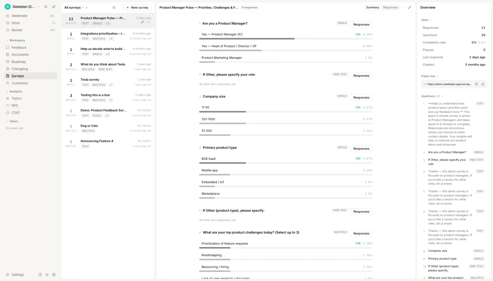
That is the half Sleekplan covers. The functional and dysfunctional questions are two multi-choice steps in a survey, so the pair fits the standard question types with nothing custom. Target it at a segment rather than a list, and run it in-app, where it reaches someone inside the product, or as a standalone hosted link for customers you want to reach by email. Conditional steps let you skip a feature block for people who have never opened that part of the product, which is the single biggest source of Indifferent noise.
The built-in analytics give you the per-question breakdown, which is exactly the shape the scorer above wants: counts per answer option, per question, per segment. Read the pairs off, enter them once, and you have the categories and both coefficients for every feature in the round.
How to do a Kano analysis
List the features you are genuinely unsure about
Five to fifteen. Kano ranks a list you already have; it does not generate one, and that is its main limitation rather than a flaw in how you run it. Leave out anything already decided, because every extra feature costs two questions and respondent attention is the budget you are spending. Past about fifteen features people start answering neutral to get to the end, which shows up later as a wall of Indifferent.
Write the question pair
One functional question, one dysfunctional question, the same five answers under both. Describe the feature by what it does for the respondent, not by its internal name. Watch the dysfunctional wording in particular: "how would you feel if exports were slower" is a different question from "how would you feel if there were no export", and only the second one is asking about absence.
Add a self-stated importance question if you expect ties
One rating per feature, 1 to 9. It costs a third of your survey length and it is what lets you order features that land in the same category. Skip it on a first round with few features; add it the moment a round comes back with four Must-be features and no way to sequence them.
Send it to real users, one segment at a time
Aim for twenty or more responses per segment, not twenty in total. A Kano table built from a mixed sample averages two different products together and the classification it produces belongs to neither of them. If you only have one sample, at least record the segment against each response so you can split it afterwards.
Score the answers
Each answer pair maps to one cell of the evaluation table. Take the most common category per feature, discarding Questionable responses, then compute Better and Worse from the remaining counts. Report all three numbers: the category says what kind of feature it is, and the two coefficients say how much the presence and the absence are each worth. Paste the counts into the scorer at the top of this page and it does both.
Questions people ask
How does the Kano model work?
It turns two survey answers into one classification. For each feature you ask how the respondent would feel if it were present and how they would feel if it were absent, on the same five-point scale. The pair of answers is looked up in a fixed five by five table, which returns one of six categories. Counting those categories across respondents gives the feature's category, and the same counts give the Better and Worse coefficients.
What are the categories of the Kano model?
Six, not five. Must-be, One-dimensional, Attractive and Indifferent describe real preferences. Reverse marks a feature the respondent actively does not want. Questionable marks a contradictory answer pair, which usually means the second question was misread, and those responses are discarded rather than counted. Most summaries list only the first five, which is why Questionable rates are so often left unexamined.
Who developed the Kano model?
Noriaki Kano, then a professor of quality management at the Tokyo University of Science, with Seraku, Takahashi and Tsuji. The founding paper is "Attractive Quality and Must-be Quality", Journal of the Japanese Society for Quality Control 14(2), 1984, pages 39 to 48. The English reproduction most teams work from is Berger and colleagues in the Center for Quality Management Journal 2(4), 1993.
What are the limitations of the Kano model?
Three that matter. It ranks a list of candidate features you already have and will not suggest one you did not think of. Its categories are not stable: an Attractive feature becomes One-dimensional and then Must-be as competitors adopt it, so a classification has a shelf life of quarters, not years. And it describes one segment at a time, so a survey sent to a mixed audience returns a result that fits nobody in it.
What questions are in a Kano model questionnaire?
Exactly two per feature, plus an optional importance rating. The functional question is "how would you feel if the product had this?" and the dysfunctional question is "how would you feel if the product did not have this?". Both use the same five answers: I like it that way, it must be that way, I am neutral, I can live with it that way, I dislike it that way. The templates at the top of this page are filled in and ready to copy.
Your roadmap,
on autopilot.
Free for 30 days. No card, no sales call. Cancel anytime.